Showing posts with label Swatches. Show all posts

Friday, 5 August 2016

Disney's Alice Through The Looking Glass Collection by OPI | Swatches


Hello Beauties!

I have the Disney's Alice Through the Looking Glass Collection by OPI to share with you today!

These gorgeous polishes were a PR gift, and I have very much enjoyed playing with them of late!


If you'd like to see these pretty shades on my nails, then please read on!


Disney's Alice Through The Looking Glass Collection by OPI


I'm Gown for Anything!


This beautiful creamy lilac is just as beautiful on the nails as it is in the bottle! I have dressed up this mani with some striping tape and some crystals from Sonailious Boutique. Two coats are shown, with top coat. Definitely one of my favourites from the collection, and a shade that looks lovely in all seasons in my opinion.

What's the Hatter with You?


Ok...so this one might be a favourite as well...how many favourites is one allowed to have? OPI describe this as a rich burgundy cream. The formula is stunning, two easy coats are shown, and this one screams Autumn/Winter to me!

Oh My Majesty!


Described by OPI as a supremely beautiful pearly alabaster, Oh My Majesty is certainly a unique polish to my collection. She has a slight, very subtle pink/gold shift and the pearly finish is not at all streaky. Beautiful. Again, I've added some silver striping tape to two of the nails as a feature, but this shade would look just as nice with gold accents.

Mad for Madness Sake.


An incredibly bright, warm fushcia pink, I'm not sure my picture captures the depth of this shade. She has a beautifully glossy finish even without top coat, and again, a great formula, with two easy coats shown.

Fearlessly Alice.


OPI describe this as a bold, cerulean blue with intrepid style... if you like bright colours on your nails you will love this one! An absolutely stunning blue that will have you unable to stop admiring your manicure! Do be careful with this one, she did stain the skin around my nails a little, and if you wore it as a mani for a number of days she may well stain your nails...use a good base coat! Oh...she's very close to a one coater as well!

Having a Big Head Day.


A gorgeous, glossy red that has an almost crelly formula that glides onto the nail like butter... I have only used one coat in the photo above, and no top coat! An absolute dream to apply, I would probably do another coat to completely cover the nail line, but I think if you were in a hurry, or didn't mind, you could get away with one. OPI always do red's in spectacular fashion.

A Mirror Escape ( Gold ) and The I's Have It ( Blue ).


The I's Have It is a pretty cornflower blue, lovely formula, and just an all-round gorgeous shade with a top formula. A Mirror Escape is the only glitter polish in the collection, and contains gold, silver and white glitters. She dries down a little dull on the nail, so definitely add a top coat to get her shining. I think she would look gorgeous paired with any of the shades from this collection!


The Disney's Alice Through The Looking Glass Collection by OPI is available from selected salons, MYER and David Jones, and is also available in a Mini Pack selection of four 3.75ml bottles.


Have you picked up any of the shades from this collection? Do leave a comment below telling me which one is your favourite shade!


Thanks so much for stopping by!


Blessings,


Lou xo


Disclaimer: As mentioned, these polishes were a PR sample. This does not affect or change my opinion of the product in any way. Cheers xo


Friday, 20 May 2016

OPI Soft Shades Collection 2016


Good Afternoon Beauties!


I hope you are all well?


I was recently sent the OPI Soft Shades 2016 collection, a collection consisting of six beautiful pastels nail polishes that I have been loving. I seriously have a "pinch me" moment whenever these arrive in my PO Box! I have some swatches of all six shades, and one nail art mani to share with you today.


Let me know which is your favourite shade in the comments below!


OPI Soft Shades Collection 2016.


OPI Soft Shades Collection 2016.


Negative Space Floral Mani... Design by Maria from So Nailicious.

I am always inspired by Maria and her team from So Nailcious! When I saw her post a tutorial for this manicure on her You Tube channel, I knew the OPI Soft Shades would be perfect for it! I have used all six of the shades in the collection in this manicure. 
Now, as you know, I am a complete nail art newby... so please be kind! Regardless of the finished product, I really enjoyed doing it, and just giving it a go, and that is the main thing! Nail polish is like makeup... experiment as much as you like...at the end of the day, you can wipe it all away!
I will leave a link to the So Nailicous website for you below.


OPI - I Am What I Amethyst.
I Am What I Amethyst is a beautiful periwinkle blue/lilac cream. She has a beautiful, smooth formula, and was opaque in two coats. I have found with all of these shades, that to do your first coat a little thinner, and then follow with a thicker second coat gives you the best results. Love this shade... while she is a pastel, she has a lovely luminosity!


OPI - It's A Boy!
It's A Boy was again opaque in two coats, and is a beautiful baby/sky blue cream. A gorgeous blue that looks beautiful in the spring and summer months in my opinion. Gorgeous on toes too!


OPI - One Chic Chick.
One Chic Chick had me very worried following application. She has quite a thick formula, probably the thickest formula in the whole collection, and initially sat very unevenly and streaky on my nails. I'm not sure how... but as she dried it completely self levelled, and left a perfectly smooth finish. I was shocked!! And pleased!! This creamy, yellow pastel has a lovely softness to it, making it a little more wearable than some brighter yellow shades. It still pulls the pinky/red tones out in my skin though, so probably not the most flattering on my skin tone. You can't win 'em all!


OPI - It's In The Cloud and This Cost Me a Mint.
It's In the Cloud is a beautiful soft, ever so slightly off white. She makes for a beautiful mani on her own, or would be a perfect base for nail art! This was one shade that I felt needed three coats. It wasn't bad with two, there were just some very faint streaks, and I am a bit fussy! Lovely smooth formula though!
This Cost me a Mint ( my middle finger ) has a ridiculously good formula, two easy smooth coats. She definitely has a green base, unlike some mint greens that can pull more blue on the nail. I would wear both of these shades all year round. Love.


OPI - Stop it! I'm Blushing.

Stop it, I'm Blushing is a lovely soft, warm blush pink that took three coats for full opacity. Such a pretty shade, and again wearable all year round in my opinion. These sort of shades look beautiful paired with gold or rose gold accents... 


So... did you pick a favourite shade? I Am What I Amethyst, and This Cost me a Mint are probably my favourite shades, along with It's in the Cloud.


This beautiful collection is available to purchase from Myer, David Jones and selected online retailers for an RRP of $19.95 AUD.


You can find the So Nailicious website here for daily Nail Inspiration!! There are links on the website for their Instagram and You Tube accounts too!


Thanks so much for stopping by!


Blessings,


Lou xo


Discalimer; These polishes were provided as a PR sample. This post is not sponsored. I just love nail polish! Cheers xo


Tuesday, 24 November 2015

Opi Venice Collection | Swatches


I'm not sure that I have loved an OPI collection as much as I love the shades in the Venice Collection.
I was gifted the mini set a few months ago, and then continued to research swatches and reviews of the other shades. Four more shades were soon purchased, and I have some manicures to share with you today! The formulas on all of these are good...two, easy coats for full opacity. They are rich and opulent, and have a good variety of shades, ranging from creamy nudes to muted pastels, to deep, rich jewel tones. I don't have the full collection, but I love each and every one that I'm showing you today!

I always preface in my nail polish posts that I am a nail polish enthusiast only... I am not a nail/nail art blogger. I take all my photographs in natural light, and do all of my mani's myself.

I hope you enjoy the swatches...do let me know which is your favourite shade!


OPI VENICE COLLECTION - My Gondola or Yours? and Worth a Pretty Penne.

I would call My Gondola or Yours? a warm black. It has an almost dirty, charcoal base which you see as you apply the first coat, which is a little patchy to be honest. The second coat will see you right, and the finish is glossy and luxe. 
It's a gorgeous black polish.

I used a sponge to apply Worth a Pretty Penne in layers to the base of my nails, building it up to full coverage, and then sheering it out as I moved up the nail. I love this combo.


OPI VENICE COLLECTION - Gelato on My Mind and Worth a Pretty Penne.

Gelato on My Mind seems to lean a little more blue in photographs, but she is a quintessential mint green, cream polish that has a gorgeous, smooth formula. Some mint polishes leave a little to be desired in the formula department, not this one. I would happily wear this shade all year round. Gorgeous.

Worth a Pretty Penne made another appearance, this time I used a thin nail striping tape as my guide, carefully placed the polish inside the taped lines, and then removed the tape immediately. I love this combo too! This mani was inspired by an nail artist on Instagram, her account name is @ellaberlin_nails .... go check her out!

My bottle of Worth a Pretty Penne is a mini... I'm thinking I might need to purchase the full size!


OPI VENICE COLLECTION - A Great Opera-tunity.

When I first saw A Great Opera-tunity, I wasn't sure that it would be flattering on my skin tone. She is a very peachy, melon shade, and I normally lean towards peachy shades that have a little more pink in them. However, I soon changed my mind once it was on my nails. It is really quite flattering I think! What do you think?

I have noticed a lot of manicures using A Great Opera-tunity paired with Worth a Pretty Penne... it 
also makes a beautiful combination!


OPI VENICE COLLECTION - Tiramisu for Two and Baroque but still Shopping.

Oh Tiramisu for Two you make me smile... a BEAUTIFUL cool toned nude that is just so flattering. I adore this shade, and the formula, again, is a beaute. 

Baroque but still Shopping has an intricate mix of both pale gold/champagne micro-glitters and larger pieces of gold glitter, giving it an almost textured, satin finish on the nail... a little bit like brushed metal. I love it. I love that it is not just a straight glitter, and I love the tone of it. I believe this is one of three limited edition shades in the collection.


OPI VENICE COLLECTION - St Mark's the Spot.

St Mark's the Spot is another one of the three limited edition shades, and as soon as I saw swatches of her I knew she had to be mine. Apologies that my photograph is a little dark, but you can still see the depth of colour, and how luminous and glowing she is... seriously stunning!! If you are a sucker for jewel toned polishes like I am, then you need this in your life!


Do you have a favourite shade? I find it hard to pick a favourite! Are there any other shades that you would recommend me to purchase?


Thanks so much for stopping by!


Blessings,


Lou xo


Saturday, 12 September 2015

Eye Of Horus Cosmetics | Review | Rave!


I am sure there are many of you out there who, like me, struggle with oily eyelids. 
Now, whilst this is not a topic of great importance in the grand scheme of things and life in general, there really is nothing worse than having your carefully applied eye makeup smeared over your eyelid/ browbone/ under eye area/ elbows/ knee caps by lunchtime or even earlier.... ok, I may be exaggerating slightly, but you get the drift. There are many products on the market that claim to be long-wearing, and many of them tend to leave us oily-eyelid-girls a little perplexed... because they're really not.

Enter Australian brand Eye Of Horus. I have been so thrilled with my experience with this Byron Bay based brand, I simply had to share my thoughts on a range of their products that I have had the pleasure to trial over the last couple of months.

" Eye of Horus illuminating essential range of cosmetics are based on formulas of the ancient Egyptians, the originators of beauty and mystique... Awaken the goddess within..."


If you would like to hear Goddess Lou's thoughts on these lovely products, then please read on! 


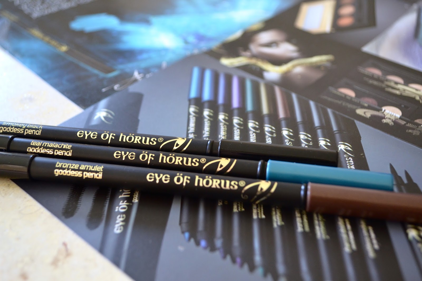
Eye Of Horus Goddess Pencils RRP $30.00 AUD.
Beautifully pigmented, smooth and easy to apply, the Goddess Pencils are one of the very few products that tick all the boxes for me. They apply beautifully, and allow a little bit of time to smudge them out if you so desire. The colours are rich and vibrant, and are available in 10 shades, with both matte and metallic finishes. I will rarely apply eyeliner to my lower lash line these days, because it just ends up migrating into the fine lines under my eyes, however these pencils will stay put for me for around 8-10 hours without smudging. I have also found them to perform beautifully on the lower and upper waterline. Liners in this area will tend to gather in my tear duct within an hour or two, however not these ones. I will do my usual double cleanse in the evenings, starting with a cleansing oil, and have no issue with removal at all. I adore these.
The Liquid Define Liner does not disappoint either. It also applies beautifully, the flexible felt-tip is easy to work with, and the formula is very pigmented. It does tend to dry very quickly, which can be an issue if you make a little mistake, I find I have to use an eye makeup remover to correct any wobbles. Again, the longevity is unlike any other liquid liner that I have tried. Even my pedestrian attempts at a little winged liner will still be intact at the end of the day. The shade Babylon Brown is a rich deep, dark brown. The swatch in the photograph further below is one pass only. Love.


Eye of Horus Dual Brow Perfect  RRP $28.00 AUD.

Eye of Horus Dual Brow Perfect - Tinted Gel.
Another absolute stand out product for me is the Dual Brow Perfect. A double ended brow product with a slightly triangular, wedge shaped, twist-up pencil nib on one end, and a lightly tinted brow gel on the other. Genius. The pencil itself is quite firm and waxy, which I love. I generally err on the side of natural with my brows, and steer away from the strong, blocked brow, as I feel it is just not flattering on my ageing face. I find the firmer, waxier pencils much easier to be able to apply in gentle, small strokes to mimic the brow hairs, however if you prefer a stronger, more defined brow this product will deliver that too! The brow gel is only very lightly tinted, very lightweight, the brush is nice and small, and holds just the right amount of gel to brush through both of my brows. It holds my brows in place all day without feeling like I have superglued them to my face. I have the shade Dynasty (brown), and it works surprisingly well for me. The tone of the pencil leans cool, which is always a good thing. I am planning to purchase the Blonde shade ( Dusk ), so I can do some side by side comparison photographs of the shades for you. This is definitely one of my favourite brow products. Love.


Eye of Horus Goddess Mascara - Babylon Brown RRP $34.95 AUD.
I cannot begin to tell you how much I love this mascara. It has been a daily go-to mascara for me, so much so that I have completely exhausted it, and need to purchase another. The wand is silicone, with both short and long bristles that grab the lashes and separate them perfectly. It is one of those mascaras that you apply and immediately wonder at how many lashes you actually have. One coat with give you length and separation, perfect for daytime. The second coat will build volume. It holds the curl, and does not smudge. At all. I have even started using it on my lower lashes, and it stays there all day. Unlike some long-wearing formulas, this one breaks up when you cleanse a little bit like a tubular mascara. Removal is painless. The shade Babylon Brown is a deep, dark, rich brown. Eye of Horus state that the formula contains waxes and organic Moringa oil to condition lashes and enhance lash growth. I have honestly not really noticed any lash growth since using it, however I feel like I am not losing as many lashes as I might normally. Two thumbs up from The Beauty Vine. If I had more thumbs, I'd put them up too...


Eye Of Horus - Swatches - Left-Right
Babylon Brown Liquid Define Liner,  Dual Brow Perfect - Pencil side, shade Dynasty.
Smokey Black Goddess Pencil, Teal Malachite Goddess Pencil, Bronze Amulet Goddess Pencil.


You can find Eye of Horus here.


They offer free shipping for orders over $50 Australia wide, and also offer International Shipping! You can find a list of stockists on their website.


Eye of Horus do not test on animals, are paraben free, and vegan friendly.


While their prices are probably mid-range, the quality and performance will not disappoint. Considering the purchase of a  L'Oreal mascara in Australia won't give you much change out of $30,  Eye of Horus gives you an affordable, cruelty free alternative to the some of the mainstream brands, and in fact, out performs a few of them in my humble opinion.


Have you tried any Eye of Horus products? Please leave a comment or question below, I always love to hear from you!


Thanks so much for stopping by!


Blessings,


Lou xo


Disclaimer: These products were kindly gifted to me for consideration. This post is not sponsored. No affiliate links are present. I'm off to order myself a mascara....

Monday, 3 August 2015

Sephora Exclusive Brands Showcase | Part 3 | Kat Von D Shade & Light Eye Contour Palette


Hello Beauties!

Part three of my Sephora Australia Exclusive Brands event coming at you today!

The much anticipated Kat Von D Shade & Light Eye Contour Palette has just hit the shelves of Sephora Australia! This palette was included in my goody bag from the event, and I have some swatches to share with you today!

There has certainly been a lot of hype in the beauty world around the Kat Von D Shade & Light palettes, with many beauty bloggers and vloggers singing their praises. I do not own the Shade & Light Contour Face palette, however I have been thoroughly enjoying playing with this one!

The Kat Von D Shade & Light Eye palette has been designed as a universal, matte eyeshadow palette consisting of three quads of eyeshadow shades to suit all skin tones. Divided up into Neutral, Cool and Warm colour families, each of the quads contain a Base, Contour, Define, and a Highlight shade. The palette includes a brochure with some pictorials and suggestions regarding placement of the shadows to either Define, Lift, or Balance your eye shape. Of course, the beauty of makeup is that there are no rules, so you can certainly mix things up and experiment with different combinations.

Kat Von D Shade & Light Eye Contour Palette


NEUTRAL QUAD
Top - laetus
From Left - samael, solas, lucius. 
NEUTRAL QUAD
From Left - leatus, samael, solas, lucius.


COOL QUAD
Top - lazarus
From Left - saleos, shax, liberatus.
COOL QUAD
From Left - lazarus, saleos, shax, liberatus.


WARM QUAD
Top - ludwig
From Left - succubus, sytry, latinus.
WARM QUAD
From Left - ludwin, succubus, sytry, latinus.

I have mentioned previously, on several occasions, that I am not a makeup artist by any stretch of the imagination. Colour choice, placement, and blending are all things I am constantly practicing, and more often than not I fail... but I keep trying!! 
Having said that, I think this palette is just beautiful, and I am really enjoying it. There are no surprises with these eyeshadows... what you see in the pan is what will translate to your skin. Beautiful colour pay-off. Whilst all of the shadows are said to be matte, I feel that the three highlight shades have a satin/matte finish...they just leave the slightest sheen on the skin, which I think looks beautiful. They are soft, and will kick up a little with your brush.

I am a big fan of using the deeper eyeshadow shades to define my upper lash line instead of having to reach for a pencil liner, and all three of the Define shades in the palette are rich and pigmented.
For a quick, everyday eye look, I like to use lazarus ( Cool Quad base shade ) all over my lid and blended up into the crease, shax  ( gorgeous black ), pressed into the upper lash line, and then tap a little bit of latinus ( highlight shade ) in the centre of my lid to brighten. A good coat of mascara ( or six ), on my pathetically blonde lashes finishes the look. 

If you are in the market for a neutral eyeshadow palette, I can warmly recommend the Kat Von D Shade & Light Eye Contour palette. If you are not in need of another neutral eyeshadow palette, but simply love neutral eyeshadows (wink wink), I am sure you will love this as much as I do...


You can find out more about Kat Von D here.


The Shade & Light Eye Contour palette retails for $65.00 AUD and
$46.00 USD.  In view of the current dollar value, and exchange rate, us Aussies are only paying just under $2.00 more than our US sisters. Not bad I'd say!!


Do you have any Kat Von D favourites? Do leave a comment below, I'd love to hear from you!


Thanks so much for stopping by!


Blessings,


Lou xo


Sunday, 24 May 2015

Laura Mercier Caviar Stick Eye Colour | Swatches and Chat

Laura Mercier's Caviar Stick Eye Colours are one of my favourite eye products. I have accumulated a modest four shades over the last 2 years, and have been trying to quiet the beauty lover's voice in my mind that keeps whispering " ...oh wouldn't it be lovely to try some more shades Lou?...." 

Anyone else hear that little voice? Do tell me I'm not alone here?

There are a number of reasons why I adore these cream shadows. They have a creamy, sophisticated  formula that once set, does not move. They have a beautiful range of shades, each of the four that I own can be quickly applied to the eye lid, and then blended up into the crease for a quick and easy one-shadow look... I'm all about that. Their compact, streamlined packaging makes them perfect for travel, and their mechanical, twist-up design means they do not require sharpening.

 Considering I have quite oily eyelids, I am always surprised by how long these last on me. I find applying a primer underneath does not work well for me, I prefer to apply these to clean eyelids, but you use whatever works for you. I find that the formula tends to adhere to the primer and not blend out as well. 

If you would like to see the shades that I own, along with swatches, then please read on!...


LAURA MERCIER CAVIAR STICK EYE COLOUR  L-R Rose Gold, Orchid, Amethyst, Cocoa


Rosegold and Orchid are both really pretty applied to the eyelid and just patted in with your fingertip.  I have always wished that Rosegold was a touch more pink ( fussy old bird I am ), but none the less, it is beautiful, and perfect for a quick and easy everyday look. I often use Orchid in the same way, it is also really pretty on the inner half of the lid, with Amethyst on the outer half, and blended into the crease. 

In the Autumn and Winter months, I love using Amethyst on its own, it is such a beautiful, deep taupe with a hint of purple. Pair it with some black winged liner and you have the perfect eye look for a night out. Cocoa is the most recent addition to my collection, and the only matte shade that I own. It has a special place in my heart, because I purchased it from Sephora in New York last year. As you can see from the swatch above, it is ridiculously pigmented. Having said that, it is still very easy to blend out. I often take an angled eyeliner brush, take some product from the tip of the pencil, and use it to line my upper lash line. It is a beautiful, rich shade, and just so creamy! Both Cocoa and Amethyst make a quick, easy and effortless smokey eye.

I love using the Real Techniques brushes with these shadows, in particular, the Base Shadow brush or the Shading Brush. Both will blend out the product perfectly... no fuss, no bother.

I purchased the shades Amethyst and Orchid from Strawberry Net last year. I know that a few people have had issues with authenticity when purchasing products from Strawberry Net, but I have not had any problems personally. They are currently listed at $44.00 AUD, which I believe is a little more expensive than what I purchased them for last year.

In Australia, Laura Mercier is sold nationally at David Jones stores , and is also available online from Adore Beauty, who currently have the Caviar Sticks for $39.00 AUD, which is a little less than Strawberry Net.


Whilst they are certainly positioned on the more expensive side, I believe that they are most definitely worth the splurge, and would not hesitate to recommend them!


Do you own any of these beautiful cream eyeshadows? Do you have any shade recommendations for me to pick up next time I am feeling weak and enabled? Do leave a comment below...I'd love to hear from you!


Thanks so much for stopping by!


Blessings,


Lou xo


Friday, 1 May 2015

OPI Hawaii Collection


 I have two shades from the OPI Hawaii Collection for Spring/Summer 2015 to share with you today! The collection consists of 12 shades, inspired by the beautiful landscapes, scenery and wildlife in picturesque Hawaii.

The two shades I have to show you are 'This Color's Making Waves" and "Just Lanai-ing Around".
I was kindly gifted these polishes for consideration, and wanted to share my swatches and thoughts with you.

These two shades are very different, but both are very beautiful, and unique to my collection.


OPI HAWAII COLLECTION - THIS COLOR'S MAKING WAVES
This Color's Making Waves is a beautiful, shimmering, deep turquoise metallic polish with a blue/green shift and subtle pink micro-glitters. I used two coats of polish and a top coat in the photograph above. Application is a little sheer with the first coat, but evens out nicely with the second. Being a metallic finish, it can sometimes show brush marks, but it is such a beautiful, vibrant shade, I love it. I will have to try a fishtail mani with this one!


OPI HAWAII COLLECTION - JUST LANAI-ING AROUND
Just Lanai-ing Around is a beautiful dusty plum shade with a delicate silver shimmer running through it. It has a lovely smooth formula, two easy coats plus a top coat. I think this type of shade is so flattering on pale skin tones, and is perfect for anytime of the year. It is one of those shades that you just want to keep wearing. Perfect.


Do you have a favourite shade from the OPI Hawaii collection?
Let me know in the comments below if I need to pick up more shades!


Thanks so much for stopping by!


Blessings,


Lou xo

Thursday, 19 February 2015

OPI Fifty Shades of Grey | Swatches and Chat

I'm afraid to say that I have not read the book, nor seen the movie, but the Fifty Shades of Grey phenomenon has certainly made its mark on me...or should I say...on my fingernails!

OPI have recently released their Fifty Shades of Grey inspired set of nail polishes in moody, sensual hues of grey, silver and red. The collection consists of four gorgeous cream formulas, one metallic, and one glitter. 

This mini set was graciously sent to me for review, and I believe I had the first shade on my nails within minutes of it being in my hot little hands. I adore them all, but have a particular fondness for the luscious cream formulas in the set. All six of the shades are sophisticated, glowing, vibrant, and utterly "grown up".

There will be full size purchases made in the near future my loves, I'll give you the tip!


I believe I have mentioned in other nail related posts, that I am a nail polish enthusiast, not a nail blogger. I photograph my mani's in natural light, and enjoy mixing up my shades. If you would like straight swatches, there are a plethera available just a click away on google.


OPI Fifty Shades of Grey - Dark Side of the Mood and My Silk Tie

Dark Side of the Mood is a stunning deep, rich, charcoal grey, which takes on an almost blueish hue in some lights. I was surprised to find the first coat to be quite sheer and a little patchy, however the second coat glides on and evens out perfectly. It is one of the those dark, mysterious, almost black polishes that just looks so sophisticated. I am sure the application would be improved with the wide curved brush that the full size polishes have, as opposed to the thiner, straight edge of the mini bottles. This shade is certainly unique in my collection...I think it is just beautiful.

A few days after wearing this as a straight mani, I thought I would try my hand at a free hand french tip using My Silk Tie. My effort is a little pedestrian, but I liked the overall effect. Definitely more practice is in order!


OPI Fifty Shades of Grey - Embrace the Grey

Embrace the Grey is the mid-toned grey of the collection, and again, another favourite. It is just so classy, particularly when paired with gold accessories in my humble opinion. This shade can lean a little warm and has a subtle olive tone to it in artificial light. I found it to dry a little darker on the nail than what you see in the bottle. Very pretty. 


OPI Fifty Shades Of Grey - Romantically Involved

Oh Romantically Involved suprised me! I am typically drawn to cool, blue based red polishes because I feel like they suit my skintone a little better than the warmer reds. Romantically Involved is quite a warm, passionate red, and I loved it. In my opinion, this formula was the most pigmented, and smooth going on the nail out of the whole collection. Two easy coats. Like butter. Glorious.


OPI Fifty Shades Of Grey - Cement the Deal, My Silk Tie and Shine for Me


In the final mani above, I had decided to use a fishtail method on my ring finger using My Silk Tie. A beautiful glowing metallic silver polish, that does unfortunately show vertical brush marks on the nail. I mentioned on Instagram that I had previously seen this fishtail technique used with a single shade of polish that has the tendency to look a little streaky on the nail, and the effect is stunning! Though terribly hard to photograph due to the reflective finish of this polish in particular, my attempt ended up looking a little more like brushed metal...which I loved. I'll have to do a full mani with this shade I think!

Cement the Deal  is a stunning, light blue/grey and is just beautiful. I have seen this shade on many different skin tones, and it is flattering on everyone! I adore it. Again, the first coat was a little patchy, but evened out perfectly with the second. Love.

Shine for Me is a gorgoeus silver and blue microglitter in a clear base that complements the other shades in the collection perfectly. It is not a loud, attention seeking glitter, just a really pretty one. 


So friends... do tell... is the book good? Is the movie good? Am I missing out loves?
Have you got your eye on any of these beautiful shades of polish? Which one is your favourite?

Please feel free to leave a comment below!


Mr Grey will see you now...


Thanks so much for stopping by!


Blessings,


Lou xo


Related Posts Plugin for WordPress, Blogger...